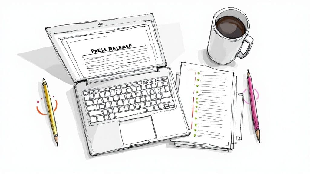
press release format word: Quick Guide to Winning Coverage
November 2, 2025
A professionally structured press release is your ticket past the digital gatekeepers. For busy journalists, the way your announcement looks in a Word doc signals whether it's credible and worth their very limited time.
Why Your Press Release Format Matters
Think of your press release as a job application for media coverage. A document riddled with inconsistent fonts, weird margins, or a confusing layout is the professional equivalent of showing up to an interview in sweatpants. It tells the recipient you just don't get it—you don't understand the industry's unwritten rules.
Journalists get buried in pitches every single day. When you hand them a polished, familiar format, you make their job easier. That alone can dramatically boost the odds of your story getting noticed. A clean, scannable layout isn't just about looking good; it's about making it effortless for an editor to find what they need: the headline, the dateline, and the core message.
Building Credibility at a Glance
Let's imagine a journalist opens two emails about a similar product launch. The first is a messy, single-paragraph wall of text. The other follows the standard press release structure, complete with clear headings, double-spaced lines, and a dedicated section for media contacts.
Which one gets a serious look? The second one, every single time. It projects competence and shows you respect the journalist's process.
The psychological impact of a professional document can't be overstated. It non-verbally communicates that you are a serious organization with legitimate news, making a journalist more receptive before they've even read the second sentence.
The Power of Professionalism
Using standardized press release formats in Microsoft Word has become a bedrock practice in public relations. In fact, over 68% of businesses say that publishing press releases has boosted their brand visibility. Many chalk this success up to using professional, well-formatted documents created right in Word. You can dig into more data on this in a detailed marketing report on press release effectiveness.
Ultimately, getting the format right in Word achieves three critical goals:
- It ensures readability: Standard fonts and spacing make the text easy on the eyes and quick to scan.
- It provides clarity: Each section has a specific job, guiding the reader through the story logically.
- It signals professionalism: It shows you've done your homework and value the journalist’s time.
Mastering this isn't just a "best practice"—it's a fundamental requirement if you're serious about earning media attention.
Setting Up Your Press Release in Word
Before you even think about writing your headline, let’s get the basics right in your Microsoft Word document. This might seem like a small detail, but it’s the first impression you make. Think of it as dressing for an interview—getting the setup right from the start shows you’re a professional who understands how the media works.
A properly formatted document is easy for a journalist to read, scan, and, most importantly, pull quotes from without any hassle.
These aren’t just arbitrary rules; they are time-tested conventions. When an editor opens your document, a familiar layout immediately puts them at ease and signals that you know what you're doing.
The goal is to remove every possible point of friction. A journalist on a tight deadline is far more likely to engage with a document that is clean, readable, and requires no reformatting on their end.
The Standard Document Setup
Let's dive into the core settings. Making these quick adjustments at the beginning will have a massive impact on the readability and professional look of your final press release format in Word.
Here’s what you need to do:
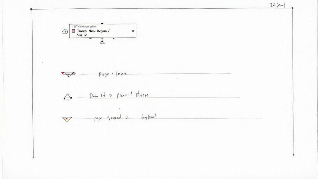
- Margins: Set them to 1-inch on all four sides—top, bottom, left, and right. This is the standard for a reason; it creates plenty of white space and keeps the page from looking cramped.
- Font: Don't get creative here. Stick with a classic, highly readable font like Times New Roman or Arial. A 12-point font size is the industry standard and perfect for on-screen or printed reading.
- Spacing: This one is a big deal. Use double-spacing for the entire document. It makes the text so much easier to scan and gives an editor physical space to jot down notes if they print it out.
Essential Word Document Settings for a Press Release
To make it even easier, here’s a quick-reference table with the essential settings. Think of this as your pre-flight checklist before you start writing.
| Setting | Recommended Value | Reasoning |
|---|---|---|
| Margins | 1-inch on all sides | Provides clean white space, improving readability and preventing a cluttered look. |
| Font Type | Times New Roman or Arial | These are professional, universally available fonts that journalists expect. |
| Font Size | 12-point | The gold standard for legibility, ensuring your text is easy to read. |
| Line Spacing | Double-spacing | Greatly enhances scannability and allows editors to make notes between lines. |
These simple tweaks are your ticket to creating a document that looks like it came from a seasoned PR pro. It’s a silent signal of competence that gets your news noticed for the right reasons.
Crafting a Powerful Header and Headline
The very top of your document is the most valuable real estate in your entire press release. It's the first thing a journalist sees, and it sets the stage for everything that follows. If you don't get this part right, you risk having your announcement immediately dismissed.
First things first, type FOR IMMEDIATE RELEASE in all caps and stick it to the top left of the page. This is the universal signal that your news is ready to be published right now. Resist the urge to get creative; this simple phrase tells an editor exactly what they need to know at a glance.
Writing a Headline That Grabs Attention
Next up is your headline. Make it bold and center it on the page. This is your one and only shot to hook a busy journalist. A bland, uninspired headline is a one-way ticket to the trash folder.
For example, a headline like "Company Launches New App" is completely forgettable and will get you nowhere.
A much better approach is something specific and impactful, like "Innovatech Unveils AI-Powered App That Reduces Food Waste by 40%." See the difference? It has a compelling statistic, clear keywords, and tells a story instantly. If you're looking for more ideas, these press release headline examples are a great source of inspiration.
Your headline needs to answer the "so what?" question in under 15 words. If a journalist can't immediately grasp why your news matters from the headline alone, they will move on.
Finalizing Your Header with the Dateline
Right after the headline, you can add an optional sub-headline in italics. This is a great spot to drop in a compelling secondary detail that couldn't fit in the main headline.
Finally, you need the dateline. This small but crucial element tells the reader where and when the news is coming from. It should be aligned to the left, right before the first sentence of your body copy.
Stick to this exact format: CITY, State – Month Day, Year –
For instance: SAN FRANCISCO, Calif. – October 26, 2024 – Getting these small, professional details right shows that you know what you're doing and helps build credibility from the very first line.
Structuring Your Story for Impact
This is where the magic happens. The body of your press release is the core of your announcement, and how you structure it in Word can make or break a journalist’s interest. Think of it less as a wall of text and more as a strategic narrative built to be scanned and understood in seconds.
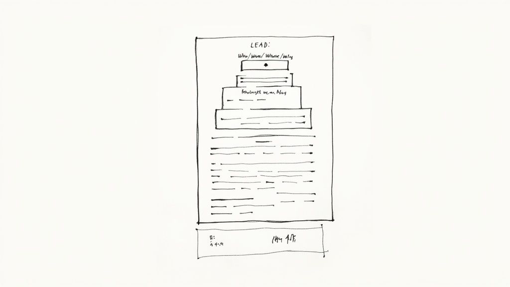
Your first paragraph—the lead—is your everything. Seriously. It needs to lay out the "who, what, when, where, and why" right away. Journalists are incredibly busy; you have to assume they might only read this single paragraph. Pack it with the most crucial, can't-miss details of your news.
The rest of your story should follow the inverted pyramid structure. It’s a classic for a reason. You start with the most newsworthy information at the top, then gradually move into supporting details, and finish with general background. This approach respects an editor's time and lets them quickly get the gist of your story.
Adding Authority with Quotes and Data
Quotes are your secret weapon for making a press release feel human. They break up the factual reporting and offer a unique perspective that simple statements can't.
When you drop a quote into your Word document, make sure it pops:
- Give it its own paragraph. Don't bury it.
- Clearly state who said it, including their full name and title. For example, "said Jane Doe, CEO of Innovatech."
- Make sure the quote adds real value. It should provide insight or a strong opinion, not just rehash a point you’ve already made.
Backing up your claims with hard data is just as important. Solid numbers give your story instant credibility. Consider this: the global press release distribution market was valued at USD 3.2 billion in 2023 and is expected to grow to USD 5.21 billion by 2033. That kind of statistic shows the power of a well-crafted release. Discover more insights about the press release market.
My rule of thumb is this: if a sentence doesn't add a crucial detail, a compelling quote, or essential context, it gets cut. Every word has to earn its place.
The Finishing Touches: Boilerplate and Sign-Off
Once you’ve told your story, it’s time for the boilerplate. This is your standard "About Us" blurb—a short paragraph that gives journalists a quick snapshot of your company. Explain who you are, what you do, and what your mission is in just two or three sentences. Understanding what makes a story newsworthy can help you craft a boilerplate that positions your company as a relevant industry player.
Finally, you need to clearly signal that the press release is over. The industry standard is simple and effective: just add a new line after your boilerplate and center three pound symbols (###). This tells any editor reading it, "That's all, folks."
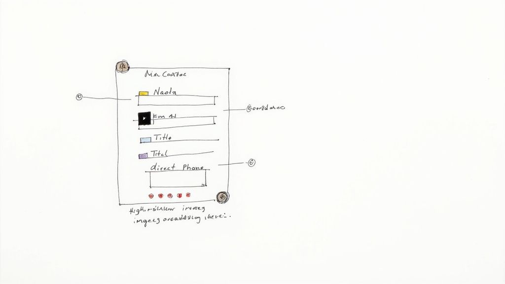
Don't Make Journalists Hunt for Your Contact Info
Let’s talk about the final, crucial pieces of your press release: the media contact block and your visual assets. After you've wrapped up your story and added the final '###' sign-off, you need to make it incredibly easy for a journalist to get in touch.
Don't bury this information. A reporter on a deadline won't waste a second digging for a phone number. Making your contact details clear and obvious is a non-negotiable part of a professional press release format in Word.
This section should come right after your boilerplate. If you're not familiar with that term, a boilerplate is just a short "about us" paragraph that gives context on your company. We have a great resource that explains what a boilerplate in a press release is if you need a quick primer.
Crafting the Perfect Media Contact Block
Think simple, scannable, and direct. This isn't the time for fancy formatting; it's all about pure information.
Here’s the essential rundown of what to include:
- A Clear Header: Just use "Media Contact:" so there's no confusion.
- Full Name: The name of the person they should actually talk to.
- Job Title: For context (e.g., Communications Director).
- Direct Email: Use a personal work email, not a generic
info@orcontact@address. - Direct Phone Number: This is key. Provide a number where they can actually reach a human being.
From my experience, providing a direct phone line can be the difference between a journalist asking a quick follow-up question or just dropping your story entirely. They simply don't have time for phone trees or generic inboxes.
By keeping this block clean and organized, you eliminate any potential frustration for the media.
Linking to Your Visuals (The Smart Way)
A good story needs good visuals. It's just a fact. But whatever you do, do not embed high-resolution images or video files directly into your Word document. It creates a monstrously large file that clogs up inboxes and is a pain to handle.
The professional way to do this is to host your assets elsewhere and simply link to them.
Create a folder in Google Drive, Dropbox, or a press kit page on your website. Then, add a simple, clear line just before your media contact section.
Something like this works perfectly:
"High-resolution images, B-roll, and company logos are available for download here."
This simple line keeps your document lightweight and gives journalists one-click access to everything they need. It’s a small touch, but it shows you respect their workflow—and that makes you a source they’ll be happy to hear from again.
Common Formatting Questions Answered
https://www.youtube.com/embed/RlPCeSHMlYc
Even with a solid template, a few questions always seem to pop up when you're putting the final touches on a press release in Word. Getting these details right can mean the difference between a journalist taking your story seriously and immediately hitting delete. Let's walk through some of the most common hurdles I've seen trip people up, so you can make sure your document is flawless.
Is a Word Doc or PDF Better?
This is probably the biggest debate, but the answer from journalists is almost always the same: send a Word document (.docx).
It’s all about making their job easier. Reporters are on tight deadlines and need to copy and paste quotes, names, and key details directly into their own systems. A PDF forces them to retype everything or wrestle with wonky formatting when they try to copy the text. Don’t make them work for it—they won’t.
How Long Should It Be?
Keep it tight. The sweet spot is 400 to 500 words, which should fit neatly on a single page. If you find yourself spilling onto a second page, that’s your cue to start cutting. Trim the fluff and get straight to the most newsworthy information. A journalist should be able to scan your release in under a minute and get the gist.
What About Quotes and Fonts?
These small details really matter for a professional look.
Handling Quotes: Make your quotes easy to spot. They should always be in their own indented paragraph. Immediately after the quote, attribute it on the same line with the speaker’s full name and title. Like this: “This new feature will completely change how our customers work,” said Jane Doe, CEO of Innovatech.
Fonts and Colors: This is not the place for creative expression. Stick to a professional, standard font like Times New Roman or Arial in 12-point size and black text.
The golden rule here is to avoid any and all creative flair. Resist the urge to use fancy colors, unique fonts, or a ton of bolding. Your goal is pure readability and professionalism, not to show off your graphic design skills.
By sorting out these common issues, you avoid the simple mistakes that can undermine your credibility. A clean, conventionally formatted Word document signals to any editor that you understand how the media works and that you respect their time, which instantly boosts your chances of getting noticed.
Ready to get your story in front of the right journalists? PressBeat uses AI to automate your press outreach, connecting your news with influential reporters to secure high-impact online coverage. Get the media attention you deserve.